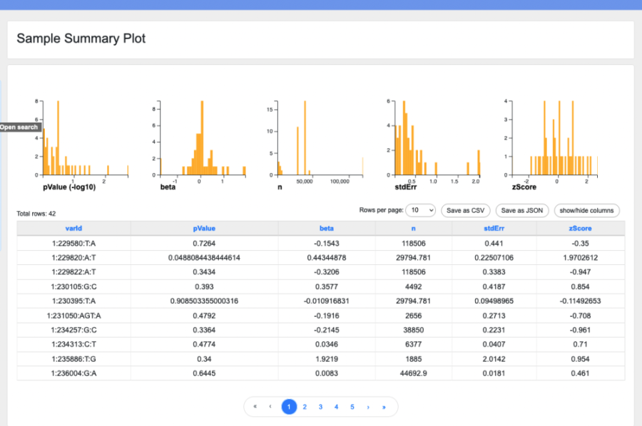
BYOR allows you to create summary plots to showcase your data, like this one (see sample page):
To display a summary plot at the top of your research page, include the attribute "summary plot" in your data table format. A data table format for a summary plot might look like this:
!["{ "top rows":[ "varId", "pValue", "beta", "n", "stdErr", "zScore" ], "summary plot":{ "plots": ["table"], "type":"histogram", "width":"200", "height":"200", "buckets":"100", "fields":[ "pValue", "beta", "n", "stdErr", "zScore"], "data convert":{"pValue":"-log10"} } }"](/sites/default/files/users/user4/Screen%20Shot%202023-01-17%20at%205.34.44%20PM.png)
The fields you will need in order to configure your summary plot are as follows:
- plots: An array of the plot options you wish to include. Currently only "table" is supported.
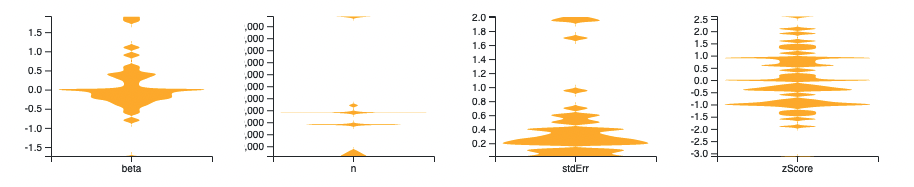
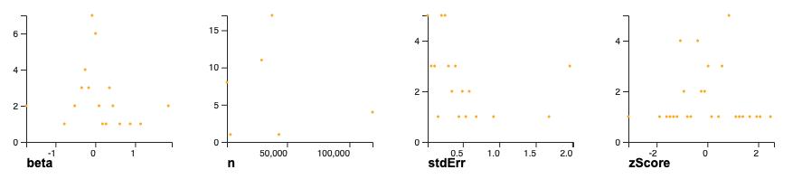
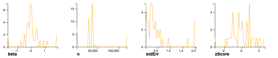
- type: Choose histogram (shown above), violin, scatterplot, or line.
- Sample violin:
- Sample scatterplot:
- Sample line:
- Sample violin:
- width: Width, in pixels, of each individual graph in the summary plot.
- height: Height, in pixels, of each individual graph in the summary plot.
- buckets: Number of "buckets" or "bins" to use in constructing a violin plot or histogram.
- fields: An array of fields whose values are numerical. Each field will be rendered as its own graph within the summary plot, showing the distribution of that attribute in the dataset.
- data convert: A JSON object in which the keys are field names and the values are strings representing a conversion to be applied to the field data before display. Currently, only the value "-log10" is supported; this displays the -log base 10 of the selected field.