BYOR offers ways to style a single research page and to style across multiple research pages. This feature can be useful if you are building a portal with multiple pages and want to give it a unified look.
First of all, you will need to know a little bit about CSS (Cascading Style Sheet) and element inspectors on any browsers. You can learn about CSS here and element inspectors here.
Style a Single Research Page
Demo: https://hugeampkpn.org/research.html?pageid=demo_vector_m_101

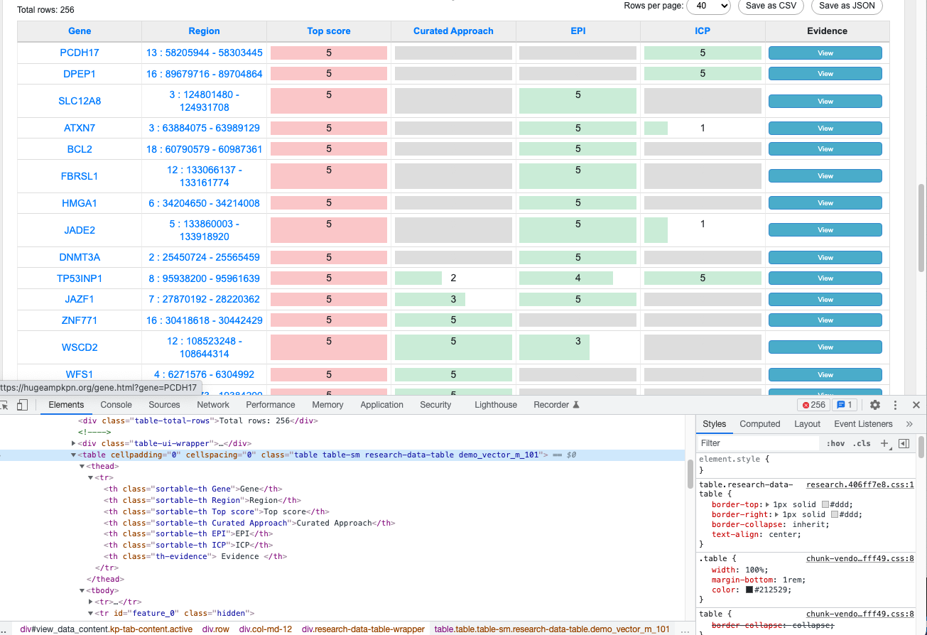
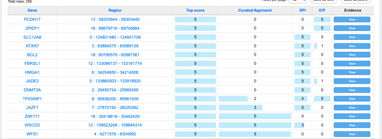
In the table shown above, you see that all columns are the same width, there is a gray background in the cells with no value, and some cells include red and green bar graphs. The image below shows how the same table would look without styling.

The table is styled by adding a few CSS styles to Page Style field in the research page configuring the demo page.

Style Your Portal
If you want to style your portal, it can be done in the "Research Pages Header Menu" node shared across your research pages.
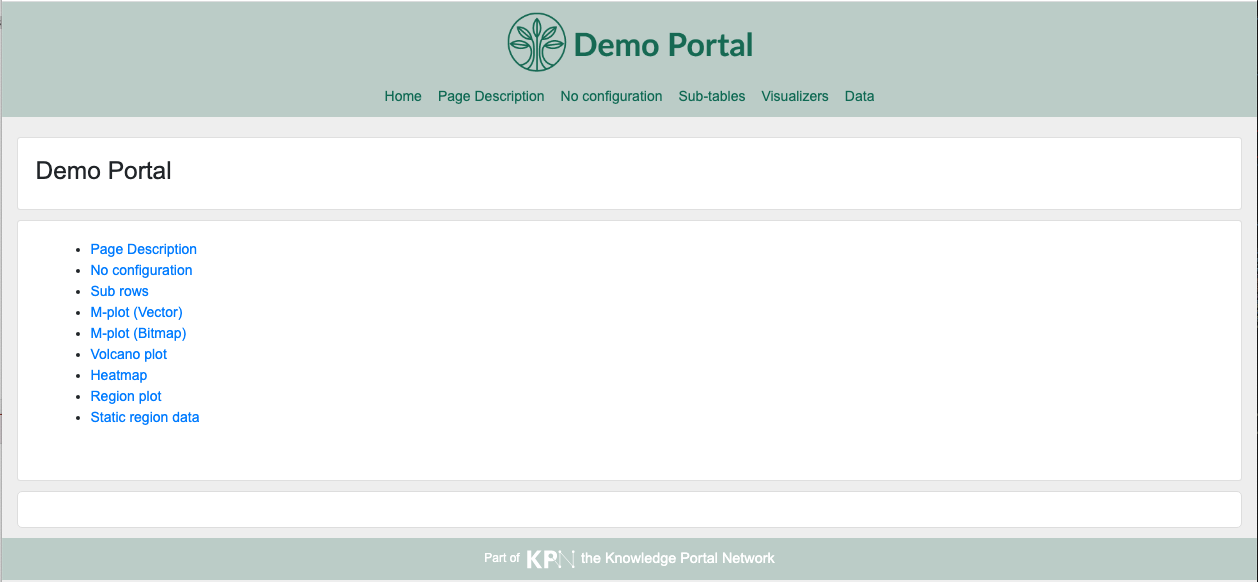
Please take a look at the demo portal. You can find that it comes with a logo in the header, and the header and footer are colored in greenish gray which is different from default blue color.

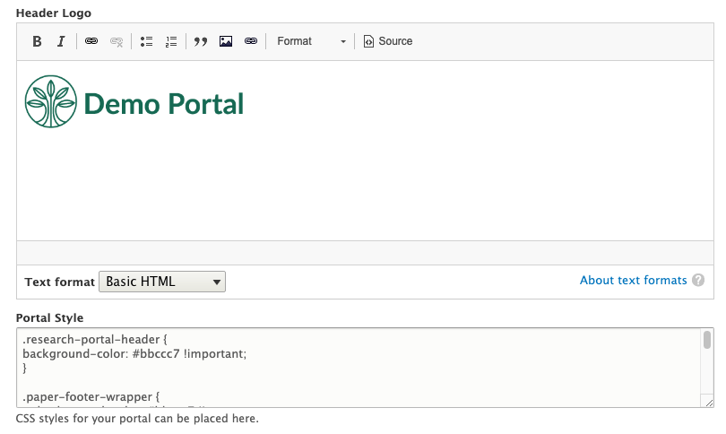
These elements can be styled by adding a logo image to the Header Logo field and adding CSS styles to the Portal Style field.

